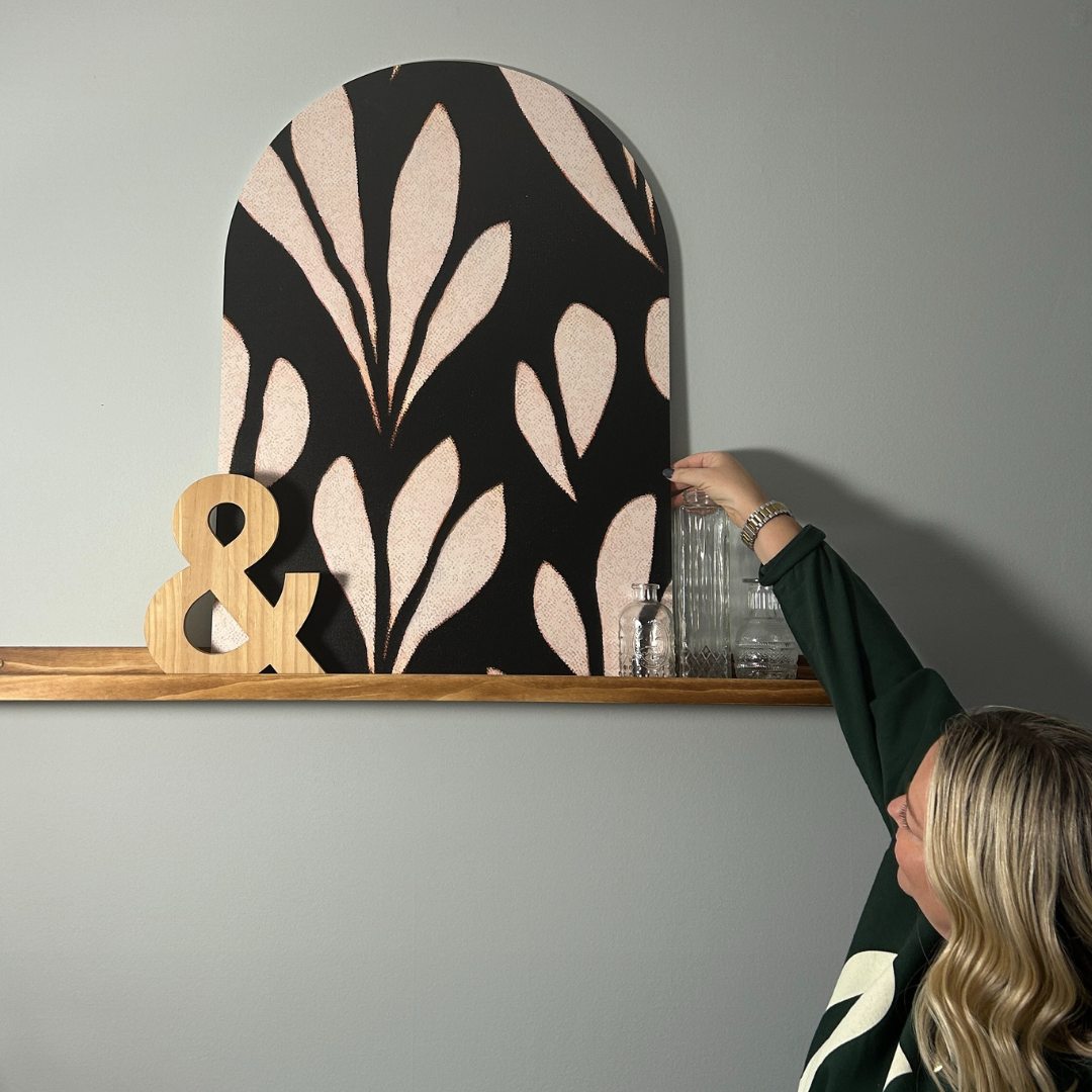
I feel like when most people here neutral, they think boring. But the reality is that neutrals are beautiful and complex. Some may say that using colors in this family is “safe” and in some cases that is true, but I would argue that going with some of these classic colors in different ways can actually be quite bold. Think about when you see someone in the winter wearing white denim with a black turtleneck sweater and how chic you think it looks. You may even go as far to say, I wish I had the guts to do something like that. Or if you go in someones home and they have a monochromatic room, all in a soft cream color, from couch to carpet, and it’s just so rich looking, you love it. The thing is that when done thoughtfully, neutrals can take on a whole new meaning, and really create a space that is stunning.
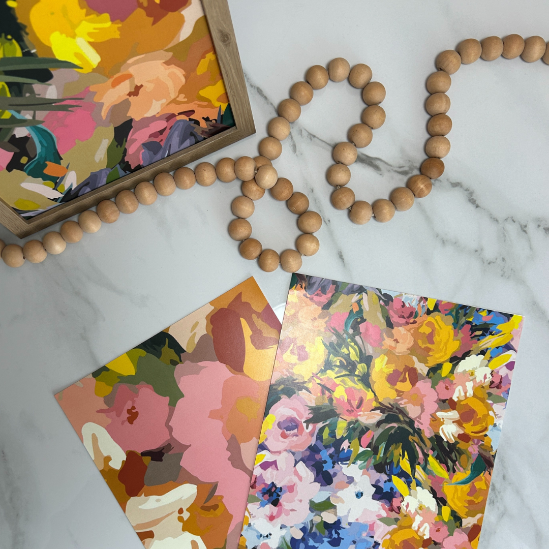
So the first thing to grasp is that neutrals are way more than just black and white, or beige. Neutrals can span other colors too and go as far as blues, greens and pinks. Truth be told, nearly any color can serve as a neutral, depending on what you pair them with. Some of my personal favorite “non traditional” neutrals are mauve and a dusty blue/green when it comes to solid colors. Other things that can also work as a neutral color are metallics.
Neutrals are not completely defined, which is what makes them so complex. They aren’t on the color wheel, but rather they are a mix of different colors to create something unique. This makes it easy to play off of the colors because at the core, they are made up of different hues. Have you ever noticed that if you look at colors in certain lighting or next to another color, they appear different? Think about when you are shopping for paint. You look at the paint chips in the store and you make really like one of the colors. You buy a pint of paint and then you swatch it on your wall. After it dries, you look at it and think, did I get the wrong color? This looks nothing like the paint chip. There are a lot of factors that play into this, but a lot of it has to do with the surroundings, the lighting, the sheen. All of these things can affect the way that the color looks. Let’s say that you choose a cool tone gray. When you get home and paint the wall, it looks like a light blue. This is because of the blue tones that are inherently in the gray and that is what is coming out in your space.
Another example is at the nail salon. You check out all the bottles and think you are picking a moody blue. They apply one coat and it isn’t quite what you thought, but you think to yourself, it’s just one coat, it will get closer once they do the second coat. Then, a few minutes later, they apply the top coat and you realize that your nails are in fact gray, not blue. This comes from that same concept of what the color is made of and how they look when in different lighting and next to other colors.
So when it comes to neutrals, I like to think of them as my baseline. A color that isn’t too bright or loud, that can kind of fade in the background if needed, but can also be the star of the show. They can be an anchor to any room, create a mood, and even be a focal point in your home. So the next time you think neutrals are boring, remember that sometimes the quiet types are the ones starring in the show.
xoxo
TFD